I have been getting a kick out of
Unhappy Hipsters lately. It basically pokes fun at modern interior design magazines (Or is it singular now, after the demise of
Metropolitan Home?) and the style their photos tend towards. Sterility has long been something I struggle with with ultra-modern interiors. I admire lines, calm, and other people's ability to live clutter-free, but am challenged by the bleak nature of concrete floors and under-filled spaces. So it's interesting that someone else has been able to express these or similar concerns in a funny way.
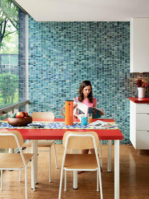
I LOVE the glass tile in this particular entry (image, sans snark, above). However, I've seen 1x2 glass tile used EXACTLY that way at Logan Airport, and the Kenmore Square T stop. So I wonder if I'd be comfortable in a dining area that has the same exact finish as the United arrivals terminal. I don't think I would be. My associations are too strong.


 Last fall I had the fun of studying Perspective and Rendering with the amazing Tommy Yamamoto. He is the master. This is my final project for that class--a rendering in watercolor based on a wireframe drawing that he provided (although I did customize furniture and light fixtures). Watercolor is incredibly fun and FAST. Can't wait to do more.


